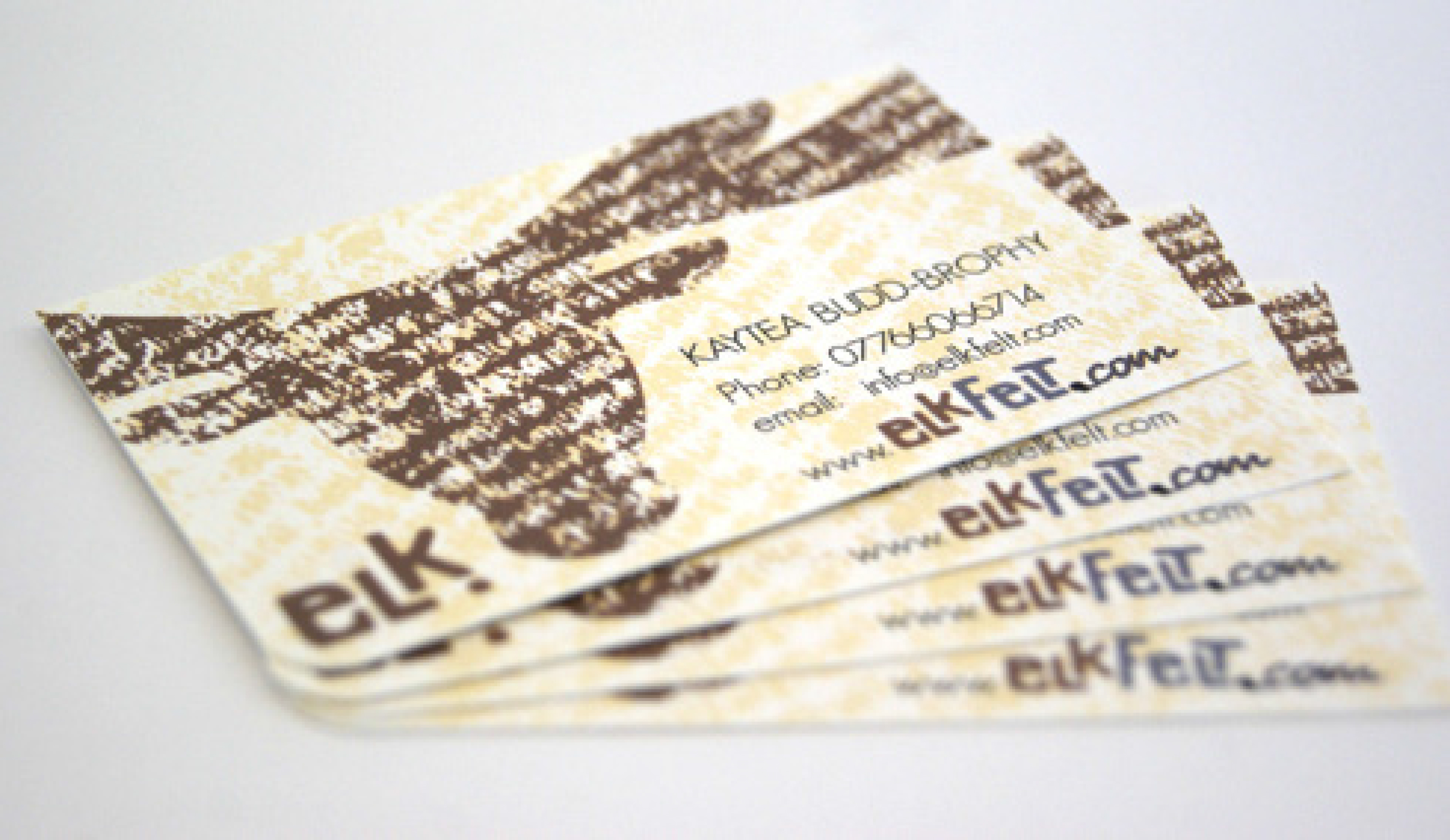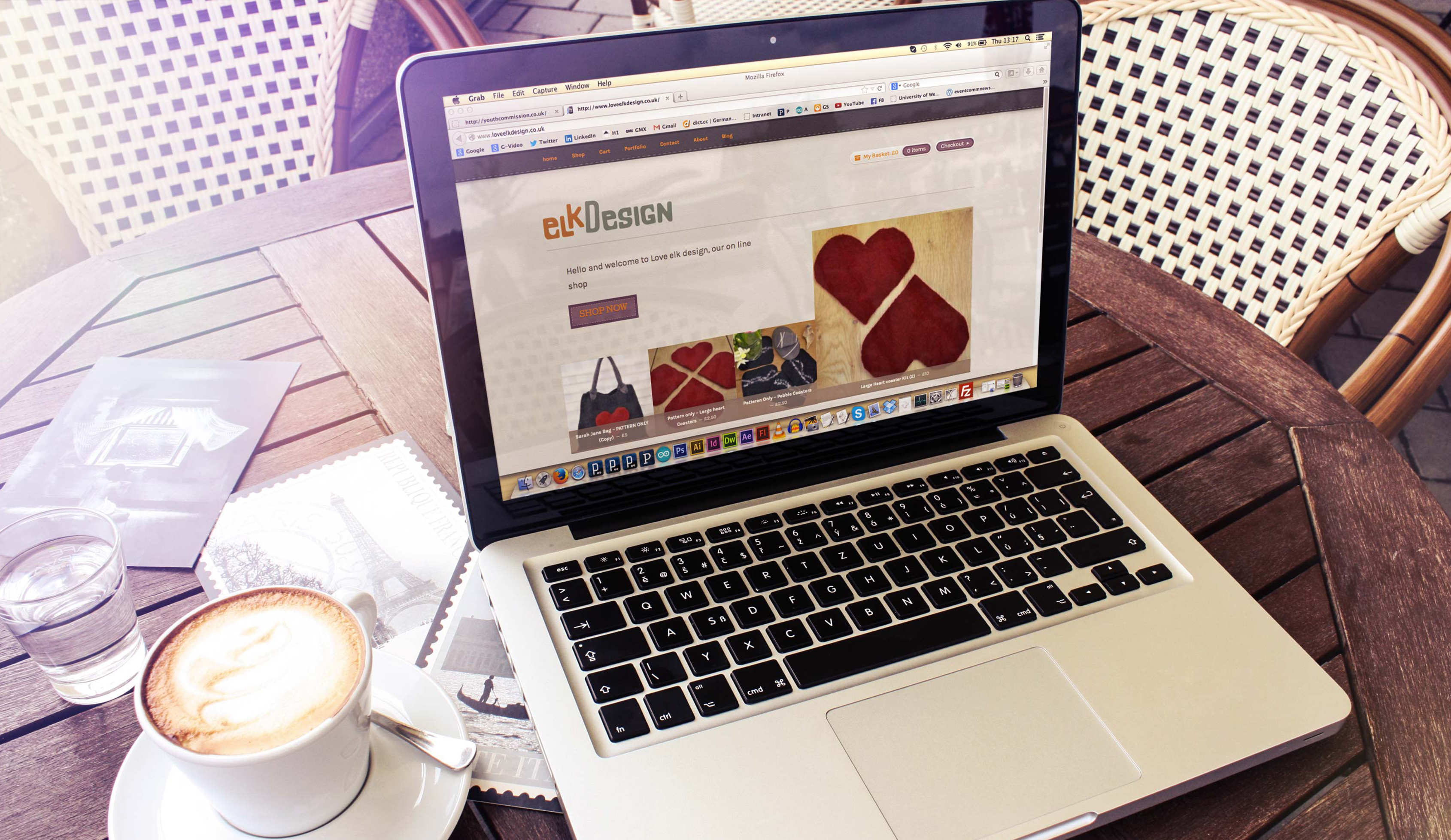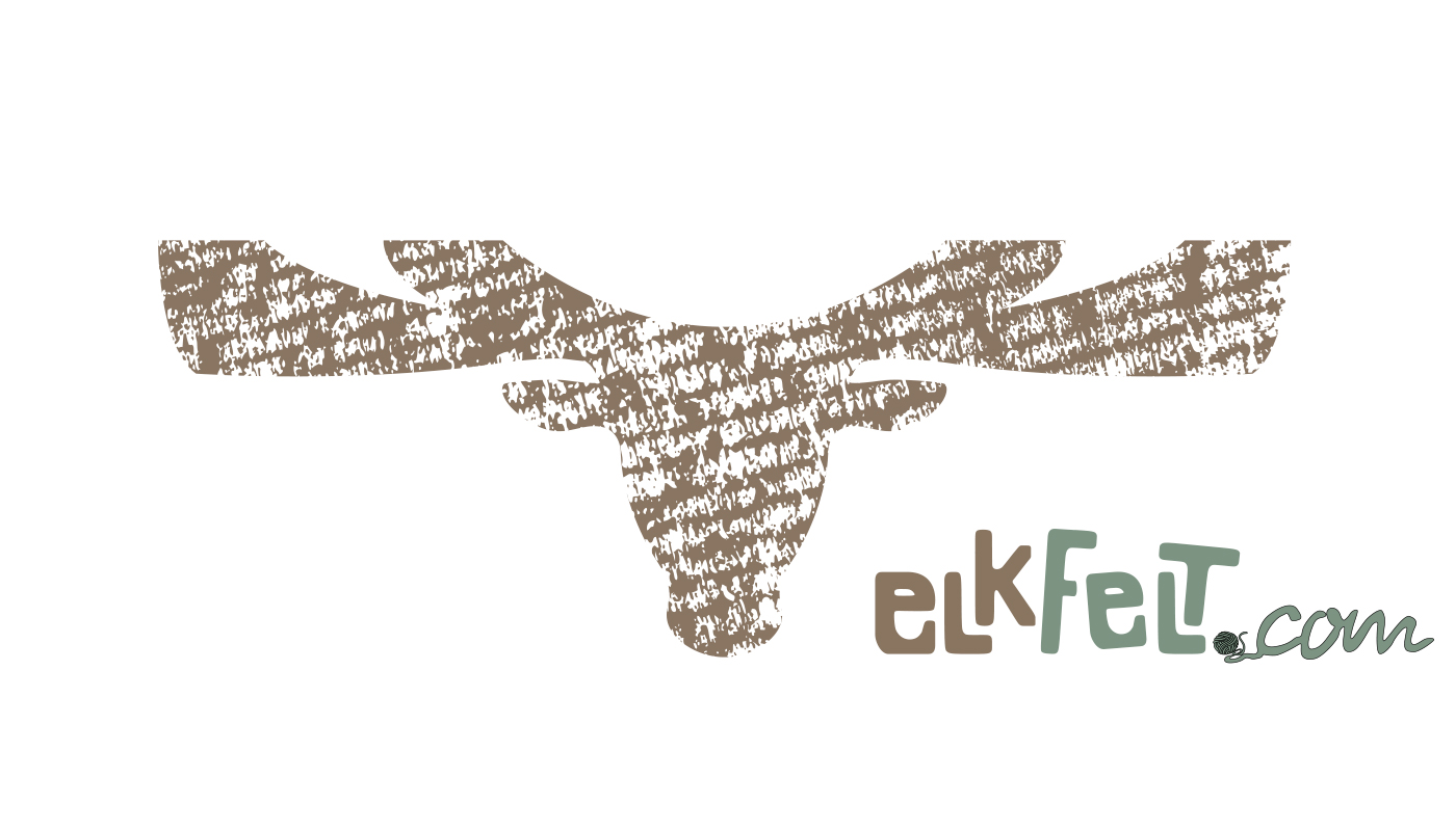
ELK. is a business that specialises in designing and selling knitting-sets through its subsidiary elkFelt (now elkDesign). The client asked for a logo-design, that could be applied on the packaging, business cards, as well as on the web, and would represent the natural, hand-made feel of the brand.
The idea for the typeface originated from a knitted cutout and was extended into a readable, yet playful typesetting. Using two different natural colours in the logo emphasises and defines between different its subsidaries. Additionally a graphical representation of a logo was produced for larger display and to support brand recognition, using organic patterns sourced from nature.
The client was satisfied with the logo, which has been applied across the website and knitting patterns, and loved the choice of colours. Furthermore she was very happy with the business card design, which has been reordered later on.